Nakoma Wellness
Designing a website and portal for fitness clients
A 4 week (~50 hour) client project

Process Overview
Timeline
October 2023- November 2023
Role
UX Design Lead
Tools
Pen and paper, Figjam, Figma
INTRODUCTION
CONTEXT
Nakoma Wellness is a fitness and nutrition coaching business based in the greater Sudbury area. They are focused on a holistic and highly personalized approach to health and fitness.
Currently, Nakoma Wellness has no online presence, besides social media accounts. Additionally, all client services and communication are through email, making contact between coach and client time-consuming and inconvenient.
PROBLEM
Nakoma Wellness needs:
-
a way to build brand recognition, awareness, and trust for potential clients.
-
a way to centralize services and resources for current clients.
SOLUTION
We set out to create a website that would address each problem.
-
Educate potential clients on Nakoma's approach and philosophy.
-
Create a portal for current clients
MY ROLE
I lead the design team throughout the project.
-
was main point of contact between the design team and the client
-
scheduled and led team syncs
-
divided and delegated work
RESEARCH
Based on previous research and work done on this project, we conducted research of our own to better understand the user.
Personas
Previously conducted user interviews gave us insight to Nakoma’s clients and allowed us to empathize with the user. We discovered two distinct types of users that we needed to design for:


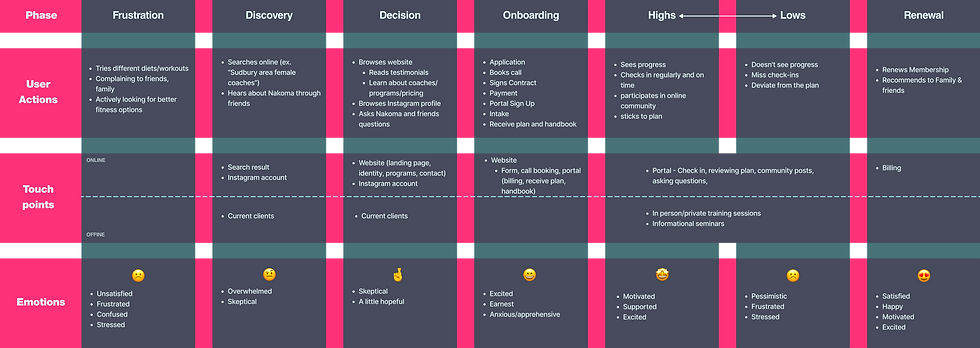
User Journey
In order to understand the Stephanie and Lisa's thoughts and emotions, we then created the ideal user journey that they would go through as Nakoma's clients. We found that Stephanie and Lisa would need the most support and encouragement during the lows of their journey with Nakoma. Therefore, the final design needed to be able to this encouragement through the portal.
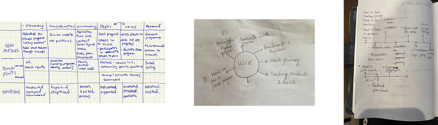
User journey sketches
Credit (from left to right): Morgan Lim, Saran Selvaraj, Xiaomei Ma)
IDEATION
To organize the pages we needed to design, we created a sitemap.
The organization of the top level pages were specified by the client. What we needed to figure out was the user portal. The portal was organized with a dashboard with frequently used features and other resources accessible through a menu.

While the top level screens were either standard or already had wireframes, we found that we needed to do screen sketches for the dashboard.
We started by finding inspiration then did quick sketches to get our ideas out. We found that we all liked the a dashboard with cards and widgets, as well including features to make the dashboard more fun and personal, such a profile picture.
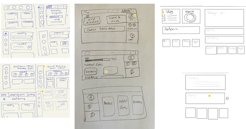
Initial sketches for the user portal.
Credit (from left to right): Morgan Lim, Saranya Selvaraj, Xiaomei Ma
We then each created a sketch for how we would combine the features and ideas we liked into one screen. Again, we discussed which parts of each sketch we liked or disliked. We decided to keep features such as a goal indicator, check in reminders, and daily meal plans.
Refined sketches for the user portal.
Credit (from left to right): Morgan Lim, Saranya Selvaraj, Xiaomei Ma
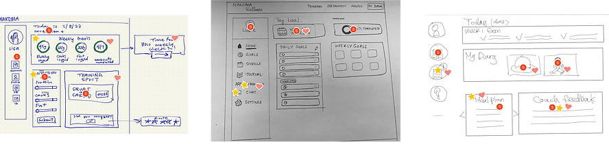
WIREFRAMING
Each page started with low fidelity wireframes based on our screen sketches or wireframes that were provided to us.


Click to enlarge.
Lofi Screens
Using the previously defined design system, we brought the screens into high fidelity.
We used inspiration images and specific requests provided by the client to create these first screens. We were aiming for a website that felt energetic and feminine but still strong.


Click to enlarge.
Hifi Screens v1
DESIGN ITERATION
Based on client feedback, we made revisions to better fit the brand image and improve features.


FINAL VERSION
NEXT STEPS & TAKEAWAYS
Next steps
The next steps would be to conduct user testing to validate this design. Additionally, more research and branding work would build a more solid foundation before moving onto development with this project.
Takeaways
Advocate for the designers. During this project, I felt that I could have spoken up more and stood firm on what we, as a team, needed to work. Oftentimes, we needed to simply work with what he had, which wasn’t the complete picture. More than once, we ended up with a design that could have been designed to address the needs and problems of the client more efficiently, or just didn’t contain essential features at all.
Ask questions. Then ask more. I wish that had been less afraid to ask questions at the risk of lookin like I didn't truly understand the project. In reality, asking all the questions I had would have been incredibly helpful to the getting on the same page as the client and making our design process more efficient.