GalleryPal
keeping the museum-goer informed and engaged
This is a 5 day modified Google Ventures design sprint provided by BiteSizeUX.
Process Overview
INTRODUCTION
CONTEXT
Oftentimes, museum-goers feel that they lack the information to fully understand and enjoy an art piece, but don't want to spend 10 minutes on Google reading an article just to learn a little more.
PROBLEM
How might we provide more information and context around artwork without distracting the user from their museum experience?
SOLUTION
An app that utilizes AR to allow the user to engage with artwork in the app, while providing varying depths of information to satisfy all the user’s curiosities.
MY ROLE
My role, as the sole designer on this project, was to run a design sprint in order to quickly test out one possible solution.
DAY 1: UNDERSTAND AND MAP
"Sometimes I feel like I'm missing out on the full experience not knowing any background information or context."
Based on user interviews, users want a more informed museum experience without being bogged down by long articles.
What users want to learn ranges from general facts to specific knowledge about the artist's upbringing. Even then, there are tiny details that viewers would not know about that would provide more meaning to the piece. Providing varying amounts of digestible information is important to satisfy user needs.
I sketched the ideal path that I would want the user to take in my solution.
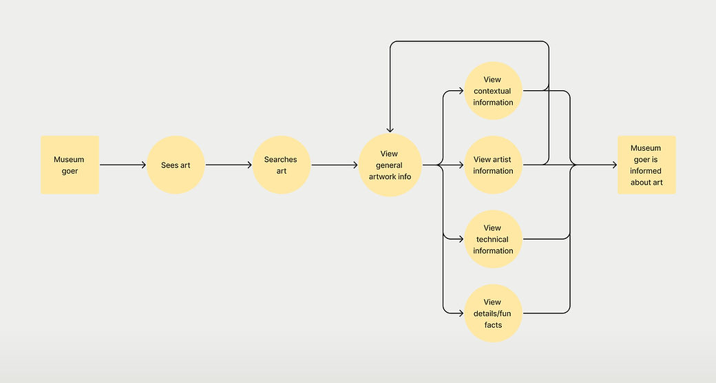
CHALLENGE MAP
DAY 2: SKETCH
First, I conducted lightning demos for inspiration.
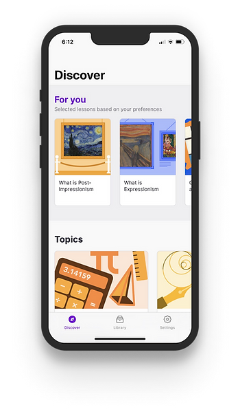
Nibble
-
Home screen allows for quick access of lesson content
-
Cards provide easy preview of content
-
Lesson screens are minimal but still interactive
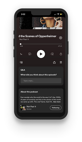
Spotify
-
Clean, digestible formatting of text
-
Audio format could be useful in this context
-
Album art is focus of the screen
AllTrails
-
The screen to view a trail provides a variety of information very efficiently, which will allow users to scan quickly.
-
In depth information is accessible

I then brainstormed ideas for the critical screen with crazy 8s.
Referring back to my day 1 map, I decided that the screen for viewing general information would be the most important, since most users are looking for quick information about the art.
Goals:
-
allow access to as little or as much information as the user wants
-
make it engaging without taking attention from the museum experience
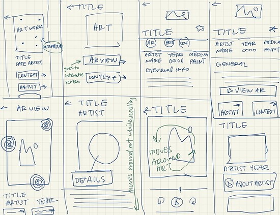
Next, I picked one screen to create a flow around.
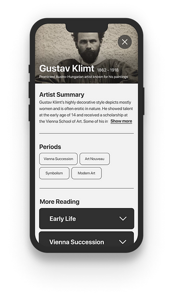
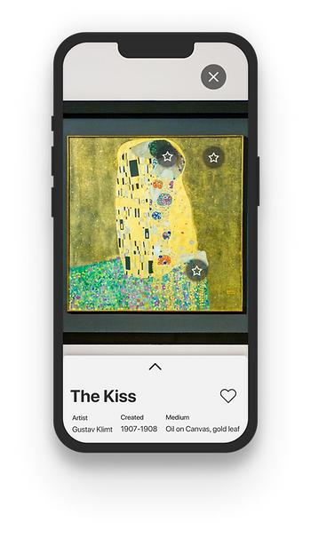
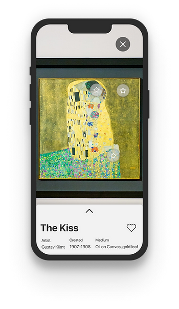
The screen I ended up choosing has an AR feature that allows the user to learn general and specific information about the artwork and artist. The AR feature would have interactive points that provide trivia on that area of the artwork and allow the user to inspect and interact with the art in real life.
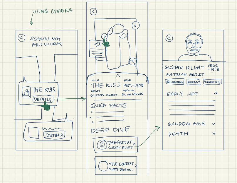
DAY 3: STORYBOARD
Building off the screens from day 3, I storyboarded my solution to create a step-by-step plan for my prototype.


DAY 4: PROTOTYPE
I chose to go with simple designs and a monochrome palette for clean and quick high fidelity screens.
I had quite a bit of trouble with prototyping the screens with AR interactions. I didn't want to make the screens too cluttered and interfere with the art, but also was not sure if the elements I used were going to be clear for users. I decided to take a risk and make something that was less cluttered but possibly unclear, and let usability testing lead me in the right direction.
DAY 5: USER TESTING
To test for any major usability issues, I conducted 5 usability tests.
I led participants through a 15-20 minute usability test, where they were asked to complete 2 tasks each. My main goal was to see whether the risky choices I made with the UI made sense to users.
All participants liked the overall layout and functionality of the app, noting that it was straightforward and intuitive. However, there were some usability issues that I discovered with testing.
ISSUE #1:
Some UI elements were ambiguous.
-
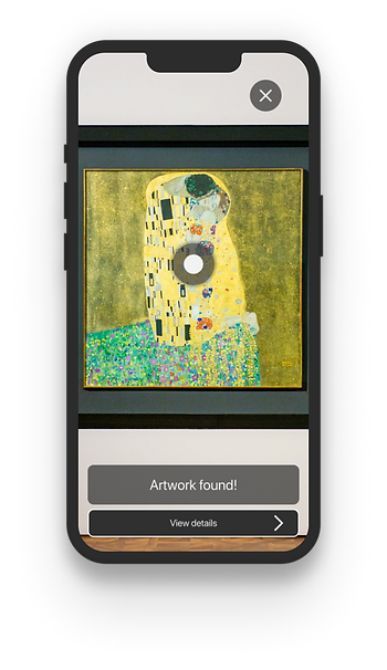
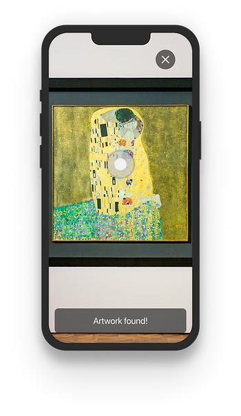
The button to view artwork details did not read as a button to some users, but did to others.
-
Some tried to interact with the "Artwork found!" element to view details, noting that it looked like a button.
Solution: Add an element that is clearly a button, but keep the circular element as an indicator of which artwork's details will be viewed.

ISSUE #2:
Some UI elements were missed or a source of confusion.
-
Participants either missed or were confused by the trivia buttons.
-
Participants eventually interacted with them out of curiosity, but initially voiced confusion about their purpose.
Solution: Add more contrast to the buttons to make them more prominent and add a label for their purpose.
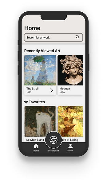
FINAL PROTOTYPE
TAKEAWAYS
I learned a lot during this sprint. More than learning how to run a design sprint, I learned more about myself as a designer.
During this sprint, I learned the importance of being thorough and thinking thoroughly each step of the design process to build reliable resources for the final design. For example, I noticed that my user flow map and storyboarding could use some work. I did not think granularly enough and ended up having to do extra thinking after the fact in order to put together the missing pieces when prototyping.