DymoHealth Logo Design
- Morgan Lim

- Mar 27, 2020
- 1 min read
Updated: Aug 20, 2020
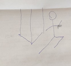
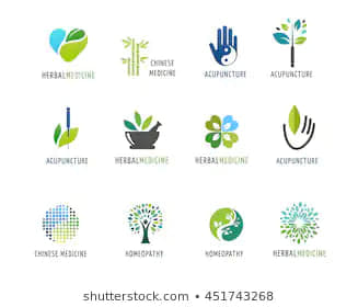
For this logo, the client wanted a design that would communicate that the company provides services related to wellness through fitness and diet. I asked if they were looking for any specific color palettes or feel to the logo. I got these two images to work off of:
The first image is a general sketch of what they were looking for. The second is the color palette they wanted.
I started with a sketch in Clip Studio Paint, to get a feel for what I was going for:

The client liked the bottom leaf design and the right figure, so I refined the sketch a bit more, asking how the colors and shapes were looking to them. We went through a few different color iterations and arrived at a bright blue that they liked.
I dropped the sketch into Adobe Illustrator and this is how it turned out!


Comentarios